zondag 20 juni 2010

Transformation.


Last Wednesday I visited the Graduation show of the senior fashion design students of the Utrecht School of Arts (HKU). A few talents caught my eye and Nynke Eggen was one of them. She made a collection named Transformation.


Her collection is based on the iconic women's suit, which represents the spirit of the past fifty years: years in which our society was predominantly around male properties. Now our society is changing; it is heading for a more feminine society and Nynke tries to express this transformation in her collection by transforming the traditional women suit.


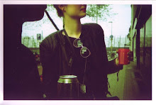
During the show, it seemed as if there was a transformation as model after model entered the catwalk. The first model seemed to wear the traditional women's suit as we know it. But the silhouette changed with each and every model. They all had references to the suit though. And the soft colored suits were combined with tough and high leather boots.


Nynke has not launched her website yet, so far we just have to do it with her pictures. But hopefully we'll hear more from her in the next couple of years!


Photography: Maurice Snabilie
Make-up: Eveline Klumpers
Models: Maiken @ Fresh Model Management & Eldrid @ Favourite Models

Written for BLEND.

Friday Food \ Coconut Macaroon Pancakes.


With the not so summery weather outside and fathers day in prospective, I thought it would be a good idea to give you some inspiration for an extensive and - of course - delicious breakfast. I've never had pancakes for breakfast before, but in the USA it's a common thing to eat in the morning. Maybe good for us Dutchmen to push our conservative old breakfast habits aside for once and try these special coconut and macaroon-flavoured pancakes. Or maybe it’s a good way to show the love for your father or the father of your children? And they're not difficult to make either: just eight ingredients and about ten minutes separate you from a stack of these little miracles.


Recipe from Heidi Swanson on 101 Cookbooks.


Written for BLEND.

donderdag 17 juni 2010

Carl Kleiner.


Carl Kleiner is a photographer with a passion for surrealism, emotional properties and geometry. The works of the Swedish photographer are definitely showing love for the beautiful things in life. He has a range of humorous, compelling and occasionally shocking images in his portfolio. Playing with props, models, colours and concepts, there are a lot of different ideas in his photography.


It's hard to choose which images of him I should share here, because there is such a variety in his works and the images are all very beautiful. He makes photographs of, for example, creepy life-size Barbie dolls, graceful paper airplanes and everyday objects arranged to produce mind-melting geometric shapes. Just take a look at the images I gathered here and check out his portfolio and blog for more brilliant works.


Written for BLEND.

Devout/Divine - Fashion vs. Religion.


Religion and its visual externalization are high on the European agenda list of topics. Burqa's are already forbidden in Belgium and soon France will also follow this example. But are burqa's and other religious garments part of rituals or are they just pure aesthetic elements?


From the 26th of June until the 9th of January 2010, the Hasselt Fashion Museum becomes the place where visitors can explore this link between fashion and religion by visiting the exhibition Devout/Divine - Fashion vs. Religion. This exhibition will not show a traditional overview of historical religious garments and textile, but focuses on the relationship between contemporary fashion and religion. It emphasizes the integration and translation of religious symbolism in designs of the past decennia. A few examples of what will be on display are original interpretations of burqa's, a praying carpet transformed into a handbag, rosaries and habits remodelled as catwalk ensembles and haute couture nuns.

Devout/Divine - Fashion vs. Religion will be a compilation of creations of national and international designers and the exhibition examines how religion is integrated in their work. Rick Owens, Walter Van Beirendonck, Mada Van Gaans and Bernhard Wilhelm are just a few names of designers that will participate in this expo.

Devout/Divine - Fashion vs. Religion

June 26, 2010 - January 9, 2011
Hasselt Fashion Museum, Hasselt Belgium

Written for BLEND.

DMY Awards: the outcome.


1. For Use/Numen - Tape Installation

Last Friday, the winners of the DMY design festival in Berlin were announced. DMY annually highlights the most exceptional works in contemporary product design. The DMT Award winners are being selected from a group out of ten projects, nominated by the international festival jury. The first place winner of the DMY Awards was For Use/Numen with their stunning and expansive installation Tape Installation, which was completely made out of transparent sticky tape. Second was the Dutch duo Daphna Isaacs & Laurens Manders with their beautiful designed centrepieces, called Tafelstukken. And EPFL+ECAL Lab came in third with their exhibition Give Me More, which explored the prospects of augmented reality.


2. Daphne Isaacs & Laurens Manders - Tafelstukken


3. EPFL+ECAL Lab - Give Me More

Written for BLEND.

Proof.


Photography often gives you the idea that the photographer just got the shot by coincidence; just walking by casually and "click" the perfect shot in one fortuitous moment. This may be true in some cases, but most of the time the perfect shot takes a lot more energy, and most important, a higher amount of shots. The exhibition Proof of the Catherine Edelman Gallery in Chicago tries to highlight this last phenomenon.


From July 16th till September 4th, 26 photographers will exhibit their contact sheets (proofs) alongside their chosen photograph. The contact sheet is akin to a diary. Few artists ever let the public see these, as it reveals their process and way of thinking. So, this show lets viewers see how the photographer's eyes framed a specific scene. Certainly recommended if you've always wanted to take a look inside an artist’s brain!


Proof
July 16th - September 4th 2010
Catherine Edelman Gallery, Chicago

Written for BLEND.

Week End by Alex Prager.


Adorned with wigs and dressed in seventies retro glamour, the characters of the photographs of Alex Prager explore American youth and pop culture in cinematic series that appear to have stepped straight off a 1950's film set. The women are staged in neon Californian landscapes, which gives a result of timeless, eerie and compelling images. "I am documenting a world that exists and doesn't exist at the same time." thus Alex Prager.


The Michael Hoppen Contemporary Gallery in London presents the most recent work, called Week End, by the rising American photographer till July 7th. Also her first move into film with Despair, a film written by Prager and directed by Requiem for a Dream's Matthew Libatique, is shown at the gallery.


Alex Prager - Week End
June 10th till July 17th 2010
Michael Hoppen Contemporary, London

Written for BLEND.

dinsdag 15 juni 2010

Fingerings.


I think most of us can share a short history of finger painting far back in our childhood, but most of us left this primitive art form far behind. But not Judith Braun; she has taken finger painting to a whole new level. She makes drawings and installations only by using her fingers, dipped in charcoal or pastel. Mostly, her drawings are in abstract forms and bilateral symmetry. Sometimes she uses both hands simultaneously to the extent of her arms’ reach to create symmetrical patterns.


Written for BLEND.

Kevin Kramp.


Kevin Kramp is a men's knitwear designer from London. He combines exaggerated, bold, soft and beautifully refreshing shapes with luxury fibres of angora, mohair, cashmere, wool, cotton, textured silks and nylons, using a wide range of colours, stitch techniques and jacquard patterns. With these techniques and fabrics he creates beautiful, innovative, sophisticated, high-concept, sexy and wearable garments.


Kramp received a first Bachelor's degree in Visual Art and a second Bachelor's degree in Fashion Design with Knitwear. His degree collection at Central St. Martins immediately caught attention of the global fashion industry.


Written for BLEND.

Altered magazine covers by Christopher Coppers.


Talking about a love-hate relationship with fashion: destructive creator Christopher Coppers certainly has one, by violently carving in fashion or beauty magazines, changing their function and appearance.


Christopher Coppers is a Brussels-based artist whose preferred medium is magazines. For the most part, his work consists of interventions, either with, within or on magazines. Combining his love for printed matter with an obvious urge for creative destruction, Christopher revisits magazines in a way that somehow gives them a second purpose.


Construction and deconstruction are important key elements in his work. He dramatically reinterprets the original covers of magazines such as Elle, Vogue, Playboy, View Magazine and many others, by intricately carving them and therefore transforming them into sculptures.


Written for BLEND.

Recht voor zijn raap.


This summer, the Central Museum Utrecht in collaboration with the Netherlands Foundation for Visual Arts, Design and Architecture, offers a platform to young and innovative artists. For this exhibition, the museum has selected visual artists, designers and architects, who have received a starter stipend for their work from the Netherlands Foundation for Visual Arts, Design and Architecture between 2006 and 2008.

The works of 31 promising young artists, who are not afraid of sharing their opinion about modern-day society, are on display. Various disciplines and talents come together: design, architecture, photography, illustration, painting, and film. Despite all diversity, the nature of the works can be characterised as clear, direct and confronting, like the title says in Dutch: recht voor zijn raap.

The exhibition is not only presenting work of up-and-coming talent, but also work of artists who have already developed themselves and became successful in the past few years. For example, Christien Meindertsma, who won the Dutch Design Award in 2008 for best design with PIG 05049. And illustrator Gijs Huijgen and fashion designer Iris van Herpen with the same prize in 2009 for their work in the categories best illustration and best product fashion, jewellery & accessory. Especially for the exhibition, several artists, like Sjocosjon and Marc Koehler, create new work.

Also a two-part catalogue about the exhibition will be published, made by the designers Alfons Hooikaas and Felix Weigand.

June 19th - September 12th

Reconsidering your health.


We all have bad habits, mostly not very healthy manners, like smoking or a daily chocolate bar addiction. Chinese product designer Daizi Zheng has found a way to encourage people to rethink their relationship between health and diet. He created a range of healthy snacks packaged to look like drugs and junk food to achieve this goal.

The project features cigarette carrot sticks, blueberries in a pill blister pack and celery french fries. Even the amount of vitamins and fat percentage is written on the packages instead of, for instance, the nicotine grade.
"Using the recognizable stereotyping packaging would make people feel more physically and physiologically connected with those daily objects. By giving the good food a little make over, it could contribute the availability of healthy food and encourages people to make a change for their everyday life." thus Daizi Zheng.
But can design encourage people to rethink their relationship with healthy food to gain a balanced diet or to stop smoking? Maybe. I know I wouldn’t just quit my occasional smoke or weekly portion of french fries. But maybe for some persons with bigger problems it could open their eyes. What do you think?

Written for BLEND.